OVERVIEW
SP Group is a leading utilities group in the Asia Pacific, providing sustainable energy solutions for customers in Singapore and the region.
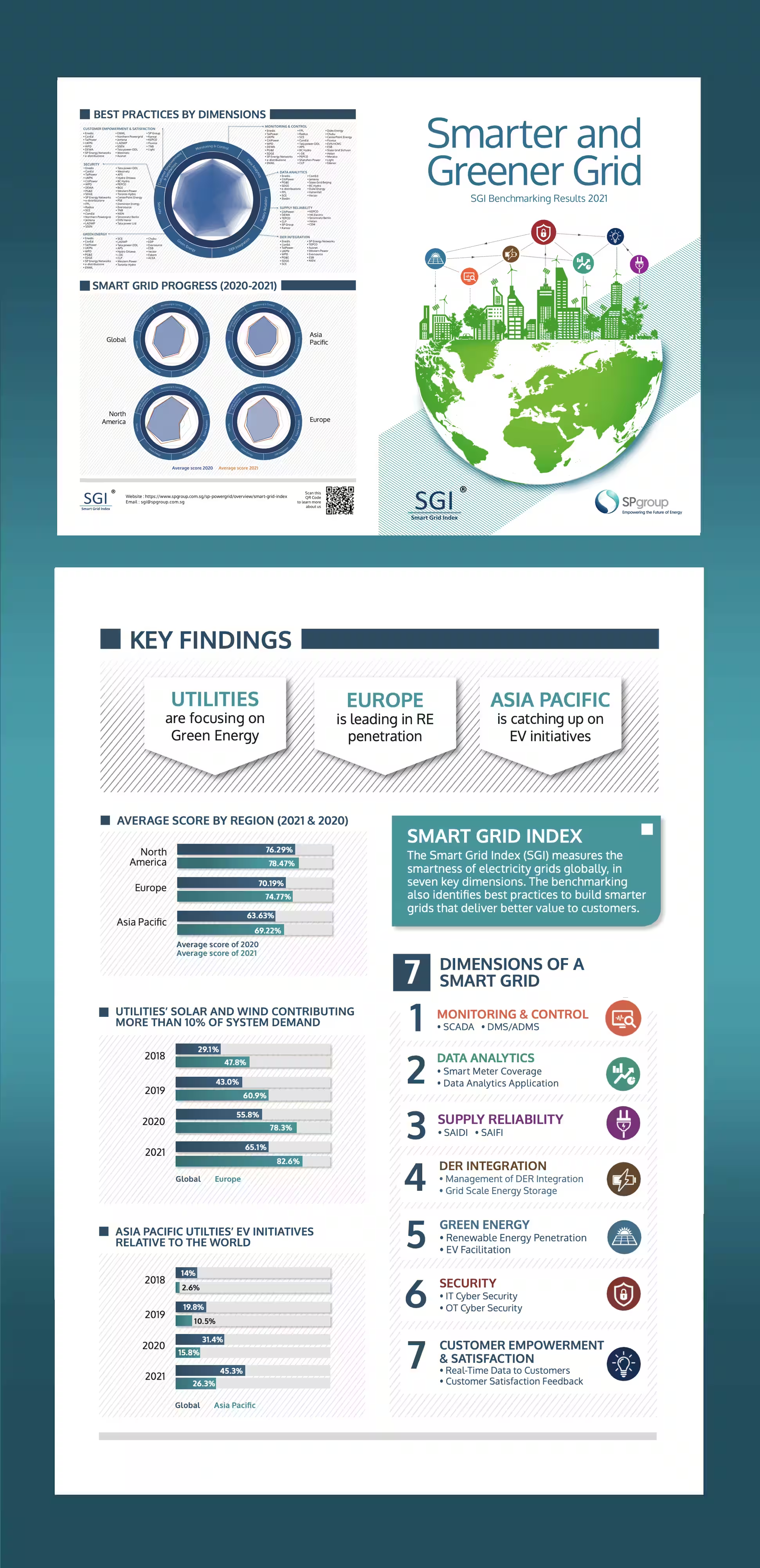
The Smart Grid Index (SGI) brochure is an annual publication that benchmarks the progress of utilities in building smarter grids. For the 2021 edition, SP Group wanted a cleaner and more contemporary presentation that could communicate a substantial amount of data clearly, while remaining engaging and accessible across both print and digital formats.
OBJECTIVES
- Create a cleaner and more contemporary visual identity
- Improve the hierarchy and readability of complex information
- Make data and findings easier to scan and understand
- Create a consistent visual language across print and digital formats
SOLUTIONS
- Clean, contemporary cover: A simple line-based illustration was adapted to convey the connected nature of smart grids while giving the publication a lighter, more modern presence.
- Clear visual flow: White space, structured layouts and consistent alignment create a clear visual hierarchy, allowing readers to move easily between key findings, charts and supporting information.
- Clear data visualisation: Charts, icons and infographics were organised into consistent visual systems, allowing dense information to remain accessible and easy to navigate.
The result is a focused, contemporary brochure that balances heavy data with a clean visual rhythm across digital and print formats. By prioritizing white space and structured typography, the design guides readers effortlessly through complex metrics, indicators, and regional comparisons.
4-PAGE SMART GRID INDEX BROCHURE DESIGN