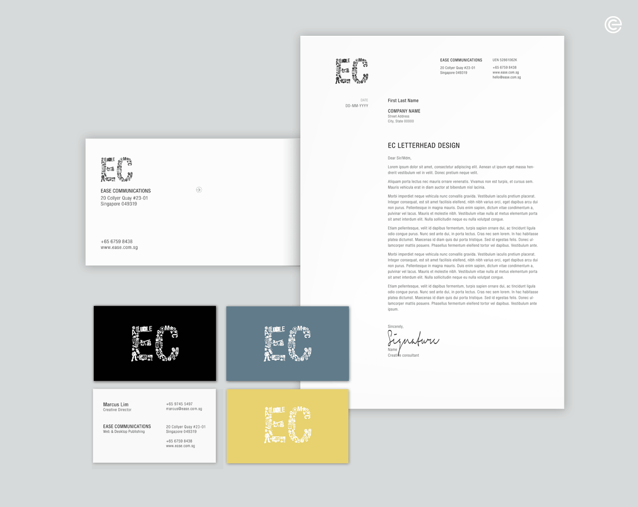
EC
BRANDING
OVERVIEW
Ease Communications’ brand identity has always been Easecom, a wordmark since 1998; one that is easy to articulate and compact in presentation.
IDEATION
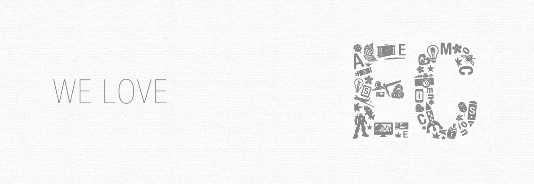
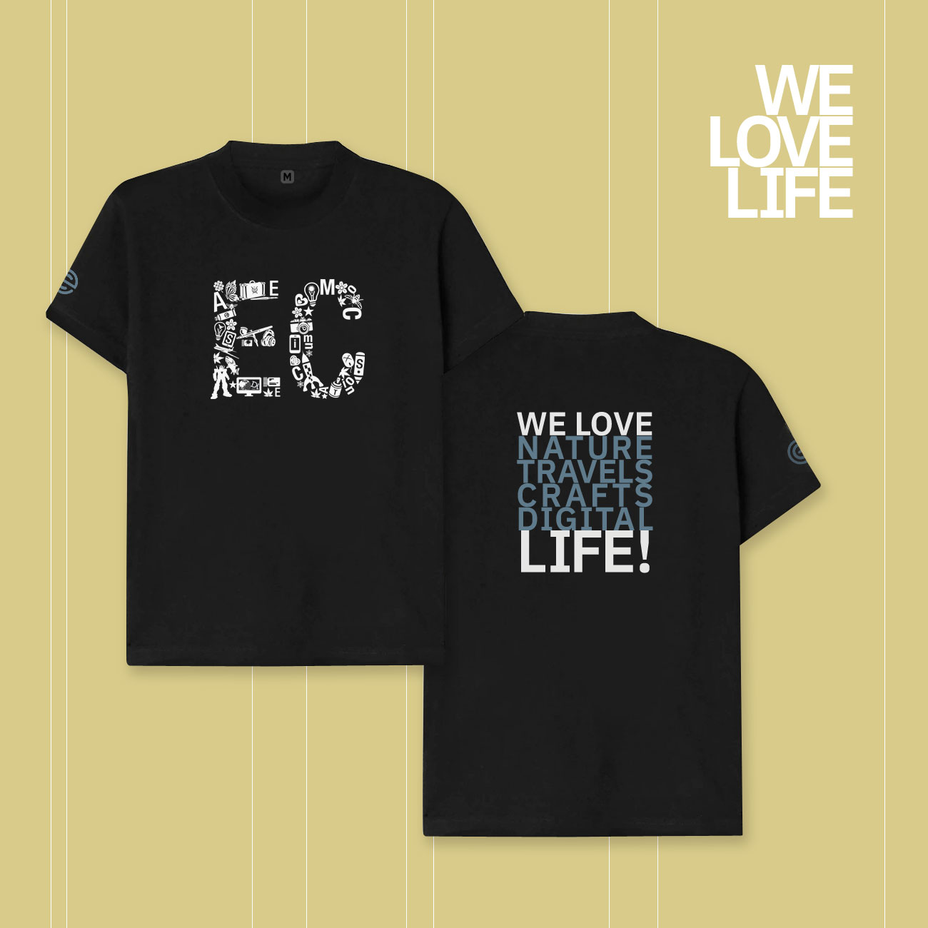
However, with our past wordmark, some have mistaken it as our business name. To simplify and strengthen our identity, we have distilled our wordmark into EC (our initials) with a smorgasbord of feisty graphics.
The graphical monogram is symbolic of the visual (art/graphics) and verbal (writing/typography) communication nature of our business.
It embodies what we love to do, the values we hold dear and the environmental issues we endeavour to address. It is about keeping our relevance with time and our creative aspirations alive.