ARIES FRESH
BRAND IDENTITY • PACKAGING • WEB DESIGN & DEVELOPMENT | 2007
OVERVIEW
Since 1993, Aries Fresh has grown from a fresh-produce importer into one of Singapore’s established suppliers of selected fruits and vegetables, serving supermarkets, hotels, restaurants and wholesalers. With an emphasis on freshness, quality and reliable supply, the company needed an identity that could carry these values consistently across its growing business.
The challenge was to give Aries Fresh a more distinctive and contemporary presence while retaining the natural associations of freshness and produce.
IDEATION
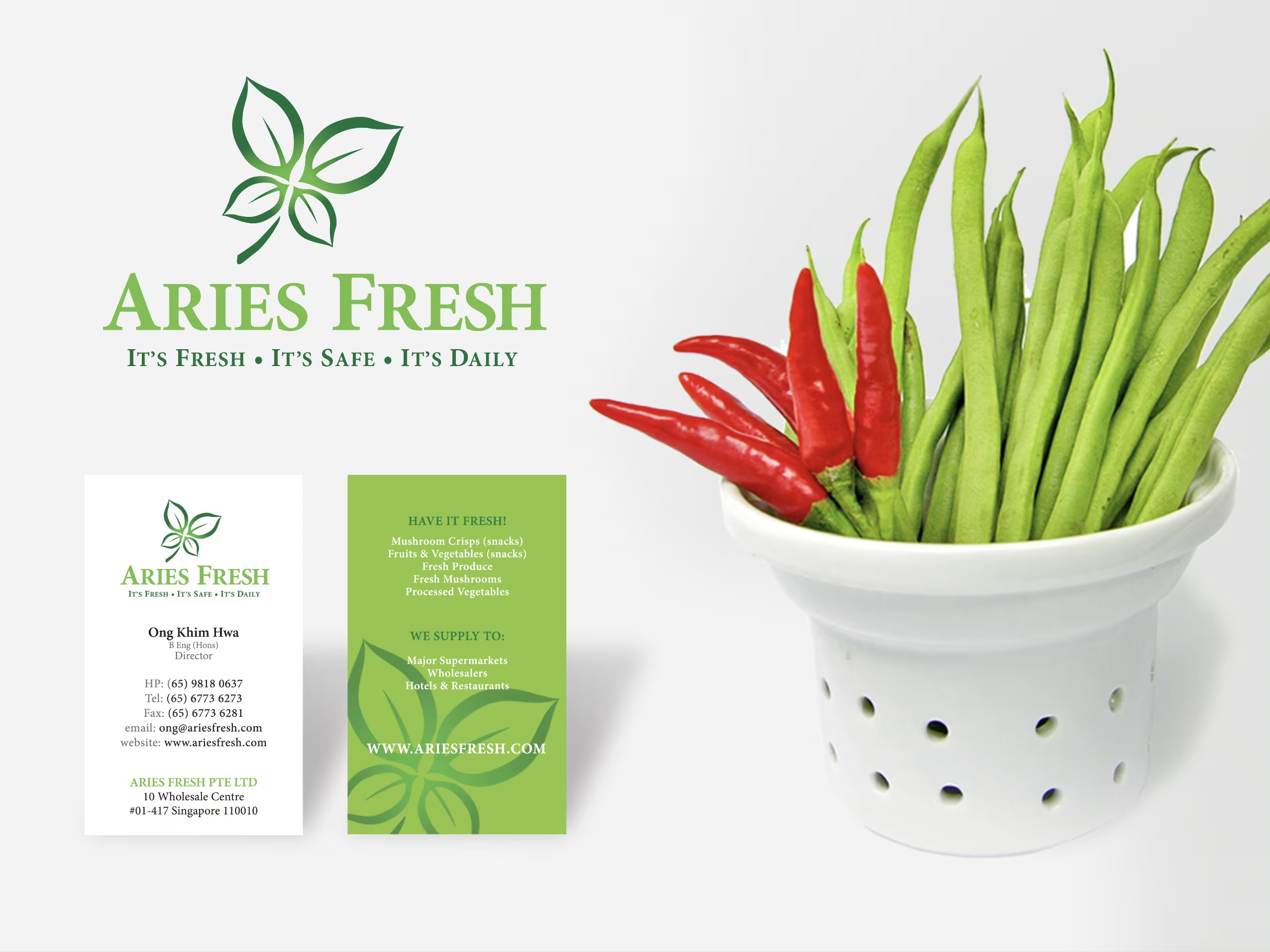
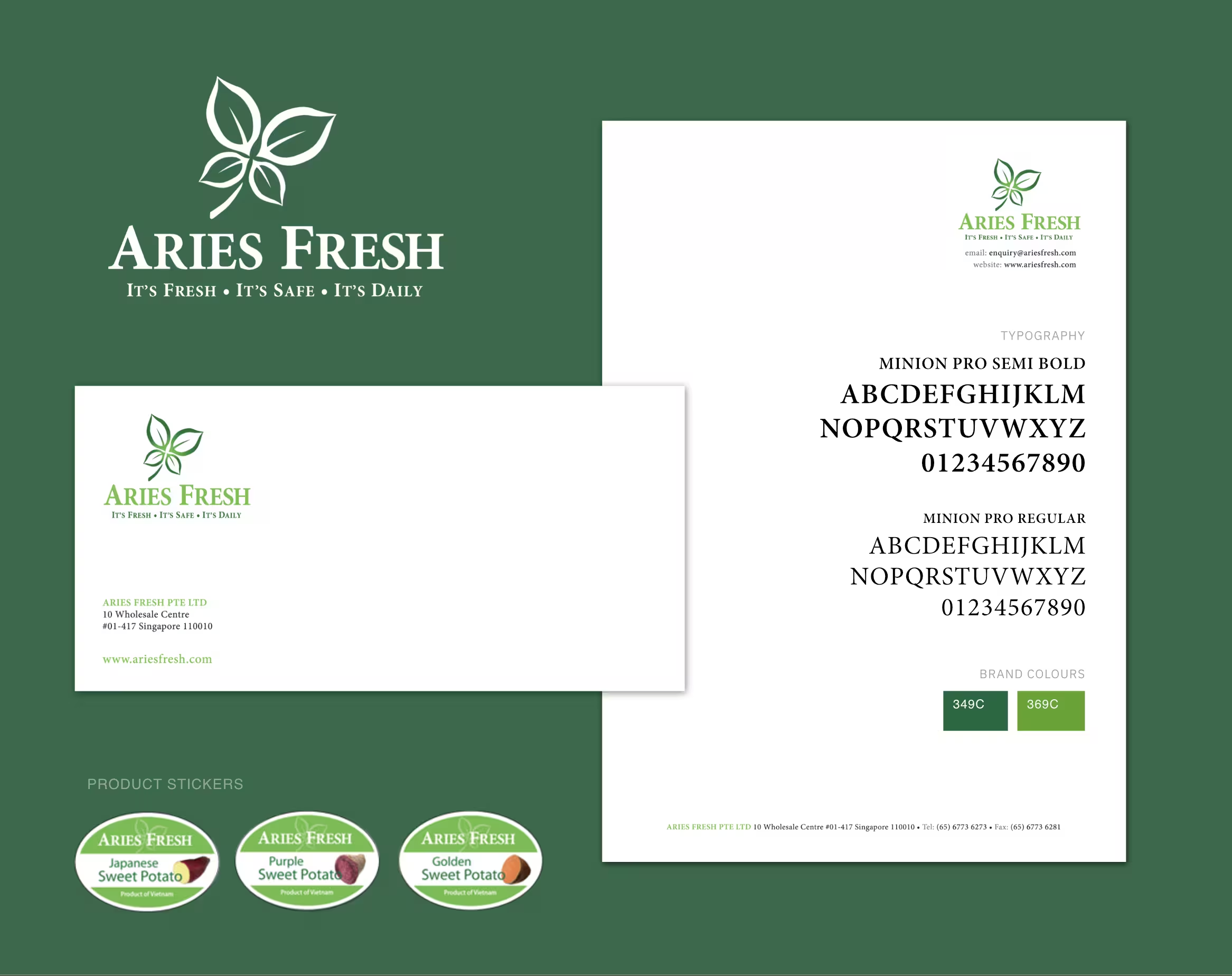
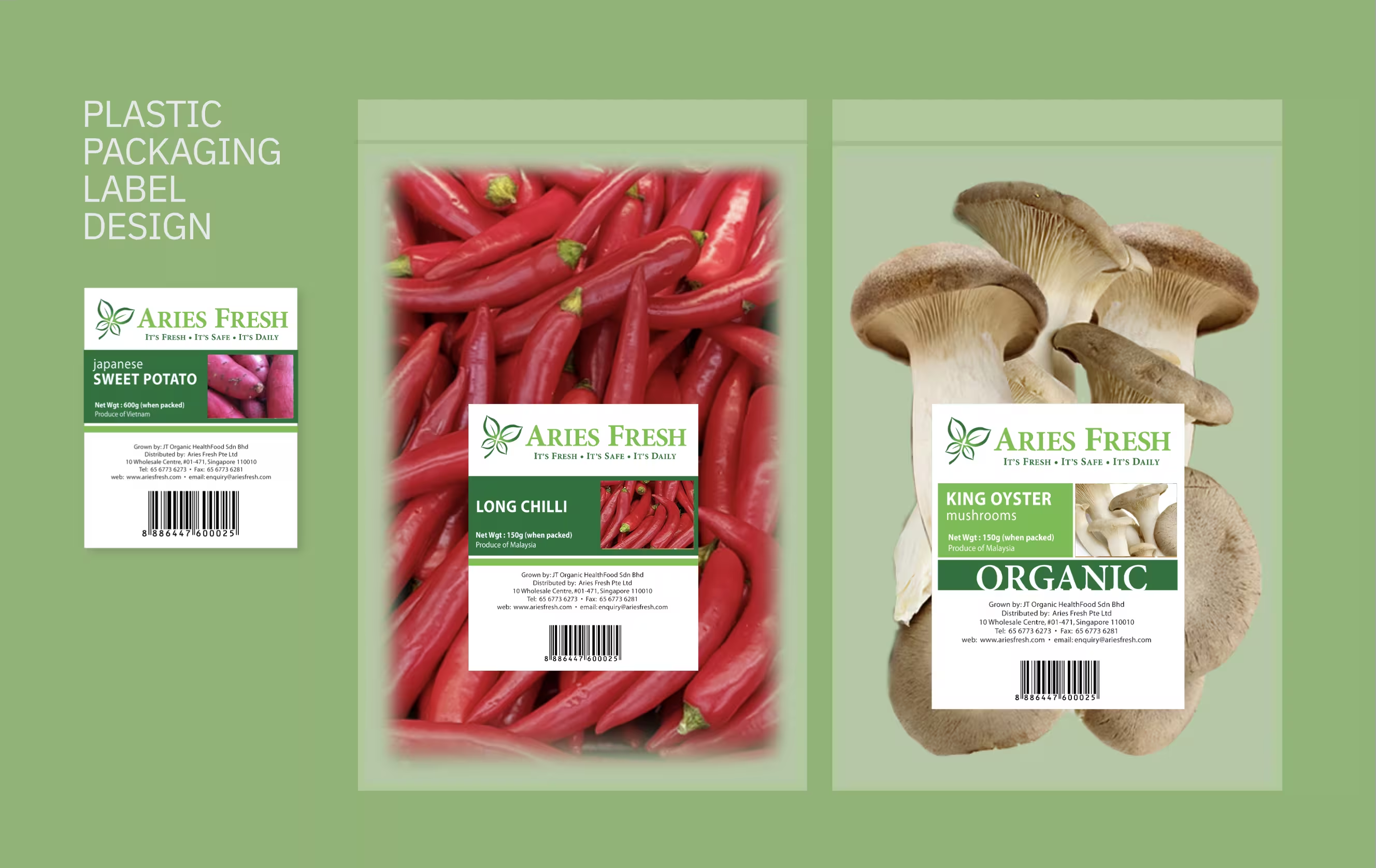
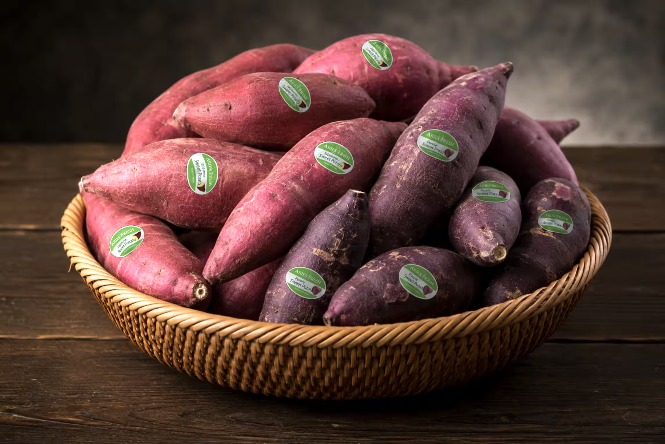
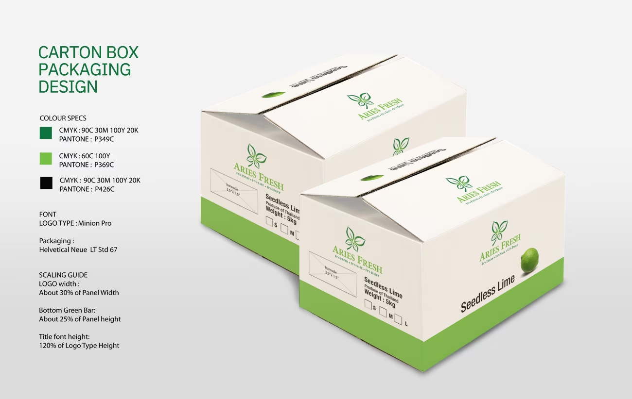
The identity takes its cue from the organic character of fresh produce. A simple leaf motif forms the central visual signature, supported by a fresh green palette and clean typography to convey vitality, trust and quality. The system was then extended across plastic packaging labels and carton boxes, creating a consistent visual language across different produce categories and pack formats.
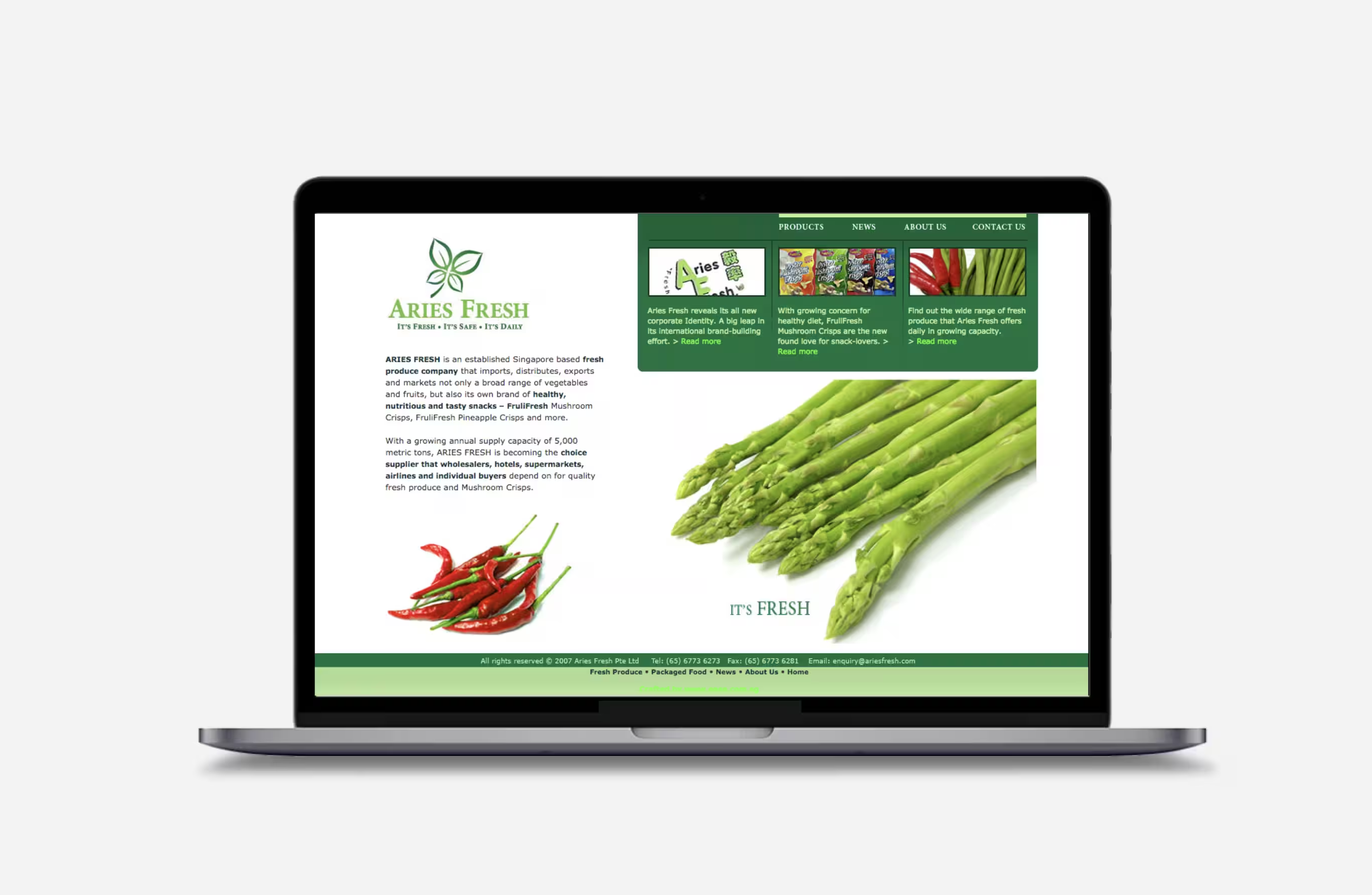
The same identity was carried into the design and development of the Aries Fresh website, where product imagery and structured information bring the brand to life in a digital environment.
The result is a fresh and cohesive brand system that moves naturally from identity to packaging and digital, giving Aries Fresh a stronger and more recognisable presence across its business.