AG HOME
BRAND IDENTITY • WEB DESIGN | 2014
OVERVIEW
Founded in 1998, AG Home was a Christian residential home supporting vulnerable teenage girls and their families through difficult circumstances. The organisation has since evolved and is now known as Gladiolus Place.
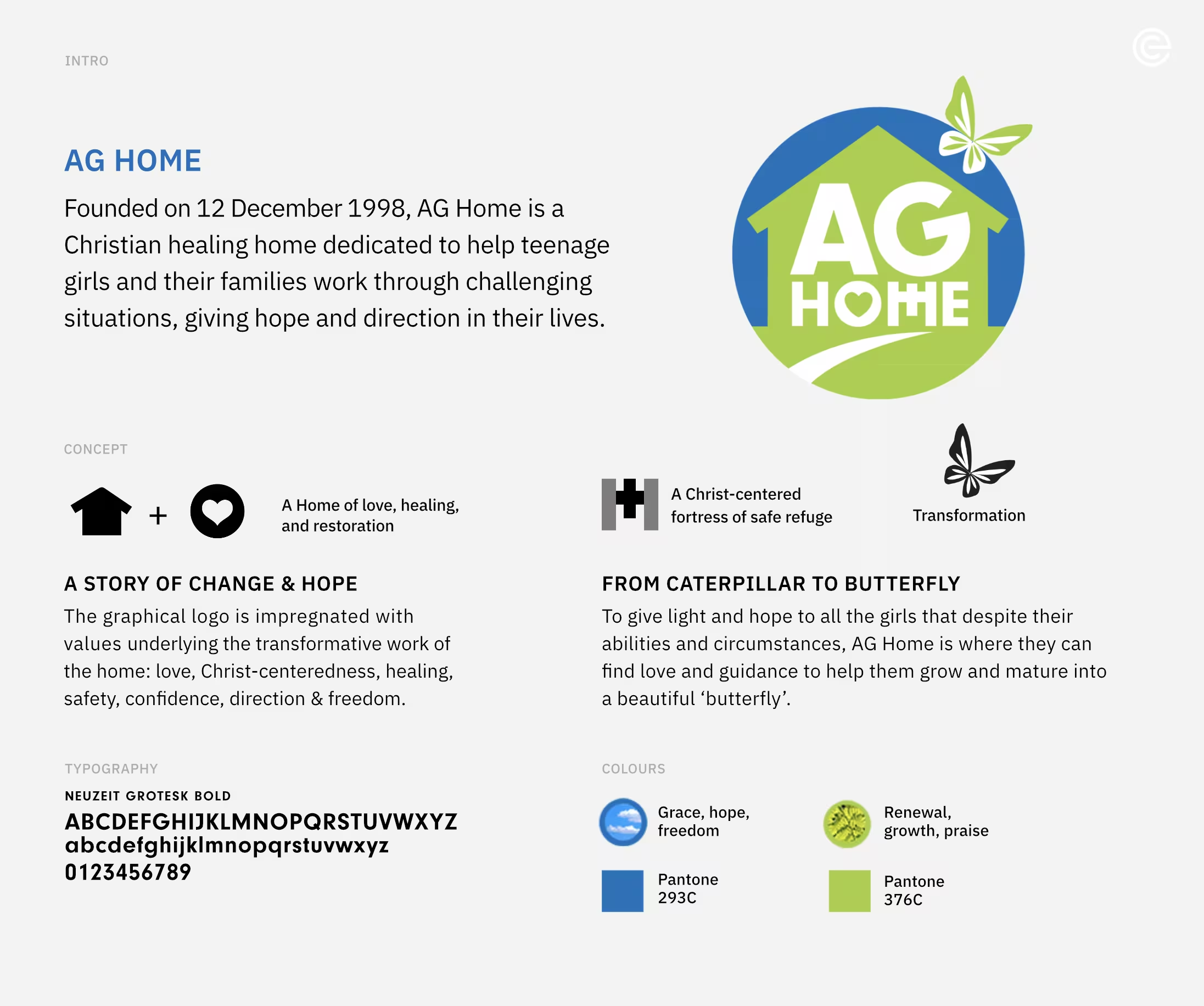
The challenge was to create an identity that could express the values at the heart of its work – love, safety, healing, confidence and hope – while moving beyond the idea of a home as simply a place of refuge. The identity needed to communicate a sense of growth, transformation and new beginnings.
IDEATION
The identity begins with a simple combination of home and heart: a place of love, healing and restoration. A second visual element, formed around a cross, introduces the idea of a Christ-centred refuge, giving the mark a sense of strength and protection.
The butterfly completes the visual narrative. Representing transformation, it reflects the journey from vulnerability towards confidence, freedom and a renewed sense of direction.
The result is an identity that frames the home not merely as a place of shelter, but as a place where lives can be nurtured, strengthened and transformed.