ONE IN A MILLION BABY
BRAND IDENTITY • WED DESIGN | 2007
OVERVIEW
One in a Million Baby is a Norwegian babywear label built around distinctive colours, playful designs and quality workmanship. The brand called for a visual identity that could feel contemporary and refined without losing the character of a children’s apparel label.
The challenge was to move away from conventional baby-themed visual cues and create a distinctly Scandinavian sensibility – simple, confident and understated – that could extend naturally across the apparel label, product brochure, promotional materials and website.
IDEATION
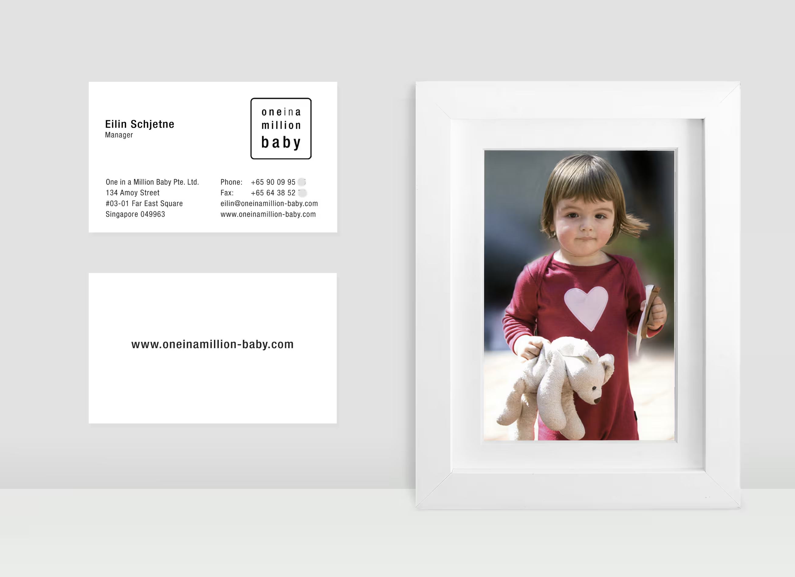
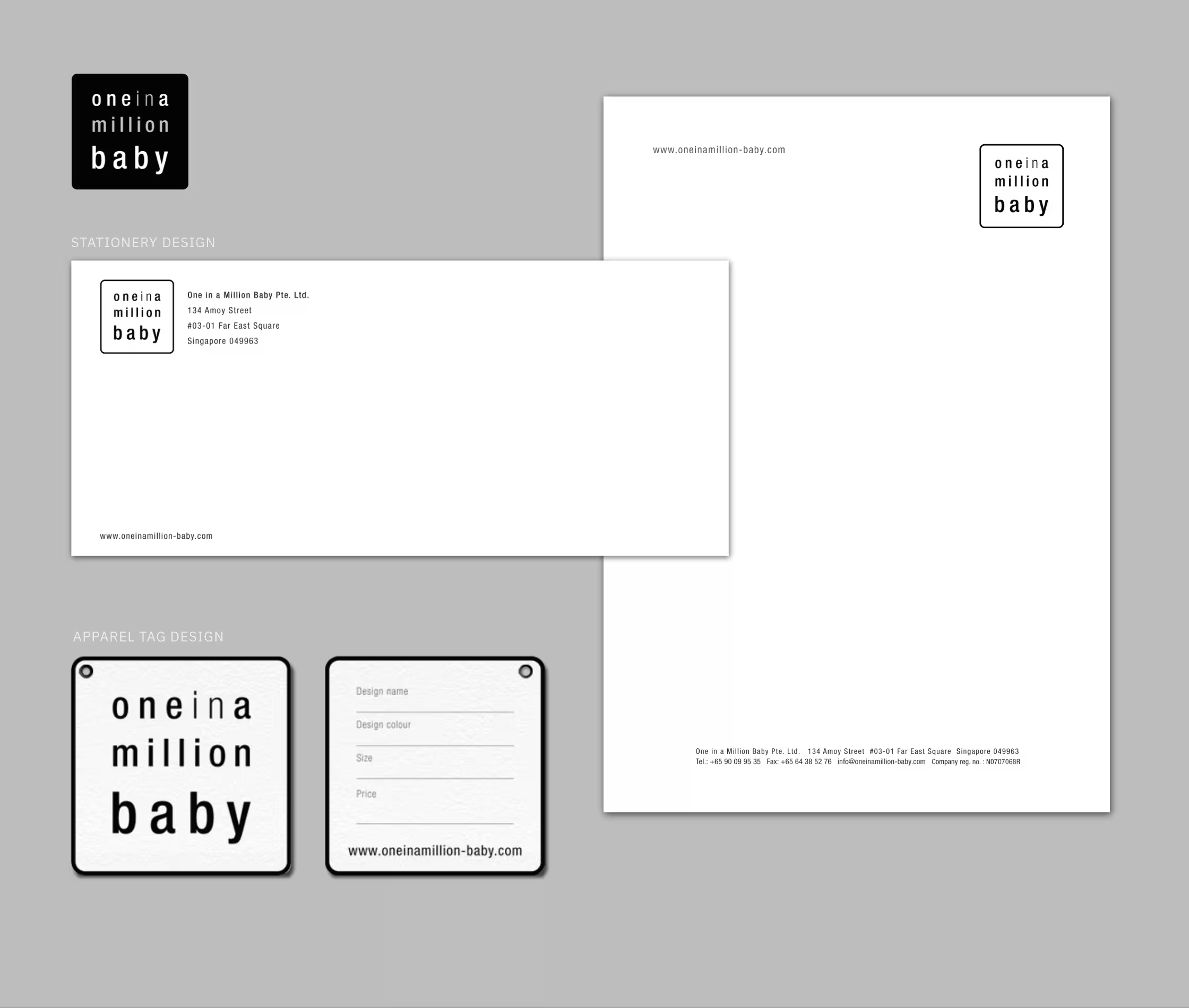
The identity takes a deliberately minimal approach, centred on a clean typographic logotype framed within a simple geometric form. Rendered primarily in black and white, it creates a quiet visual foundation that allows the bold colours, playful designs and expressive imagery of the apparel to take centre stage.
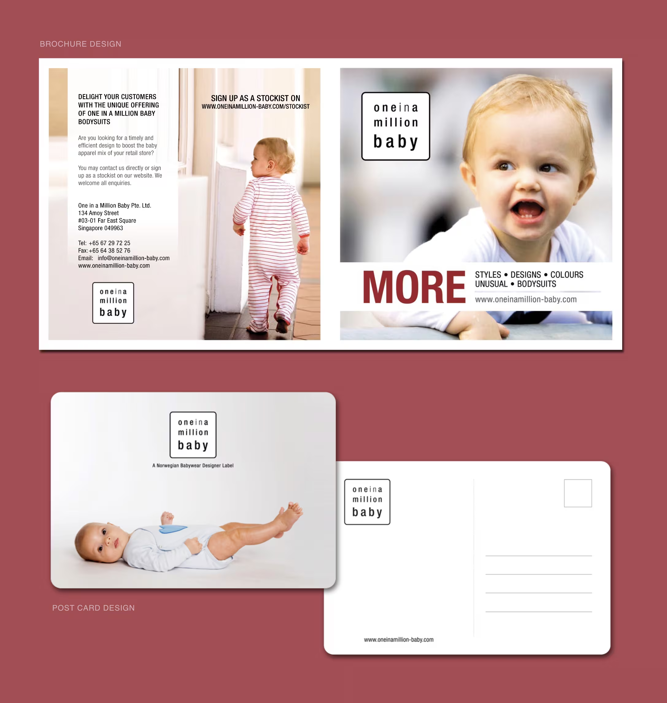
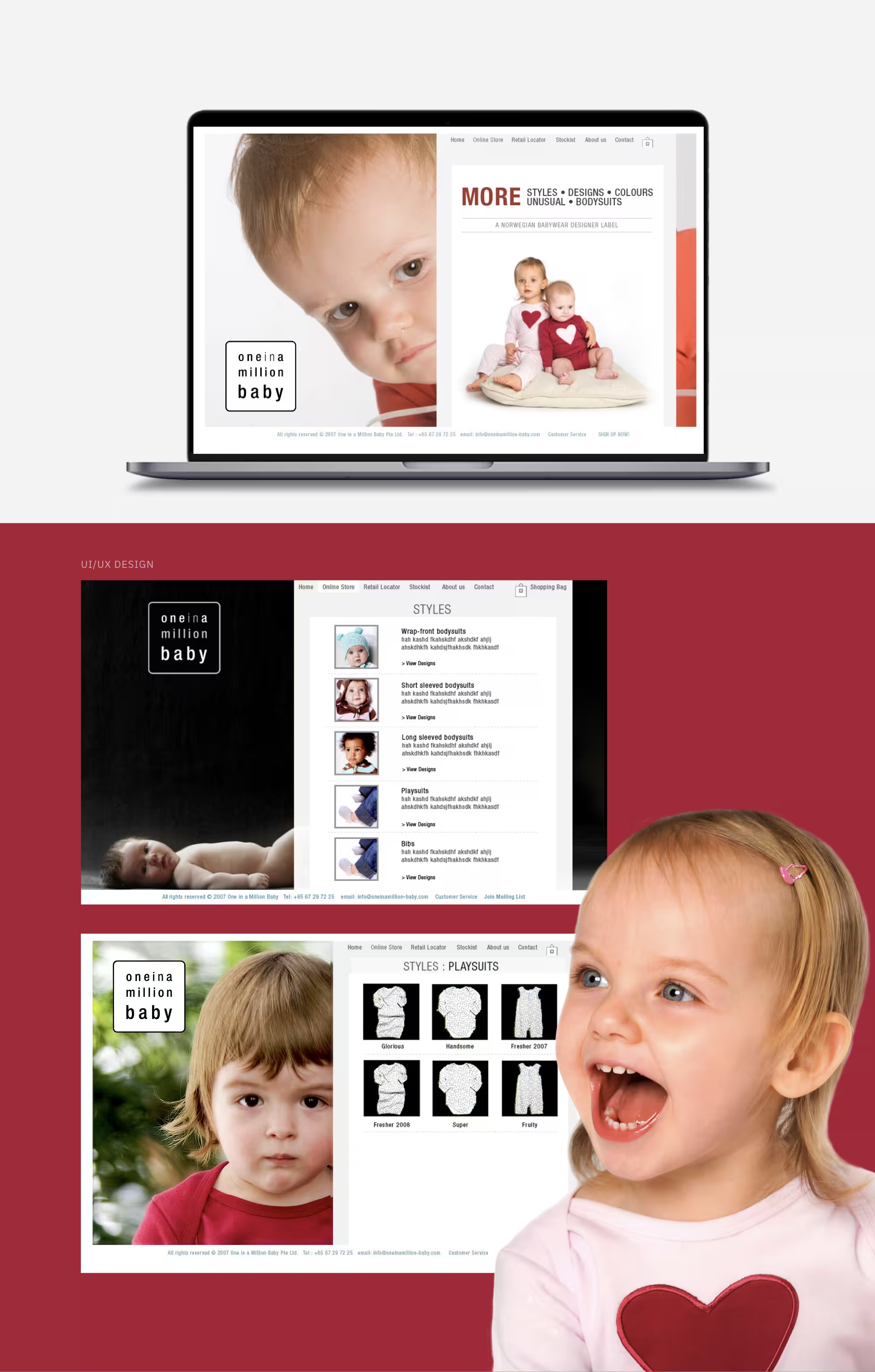
This simplicity carries through the brand’s wider touchpoints, from business cards and postcards to the product brochure and website, giving the label a consistent yet warm visual character.
The resultis a distinctive identity that adds charm and sophistication to the apparel while retaining the lightness and individuality of a contemporary babywear label.