YAMASHITA & ASSOCIATES
BRAND IDENTITY • WEB DESIGN | 2000
OVERVIEW
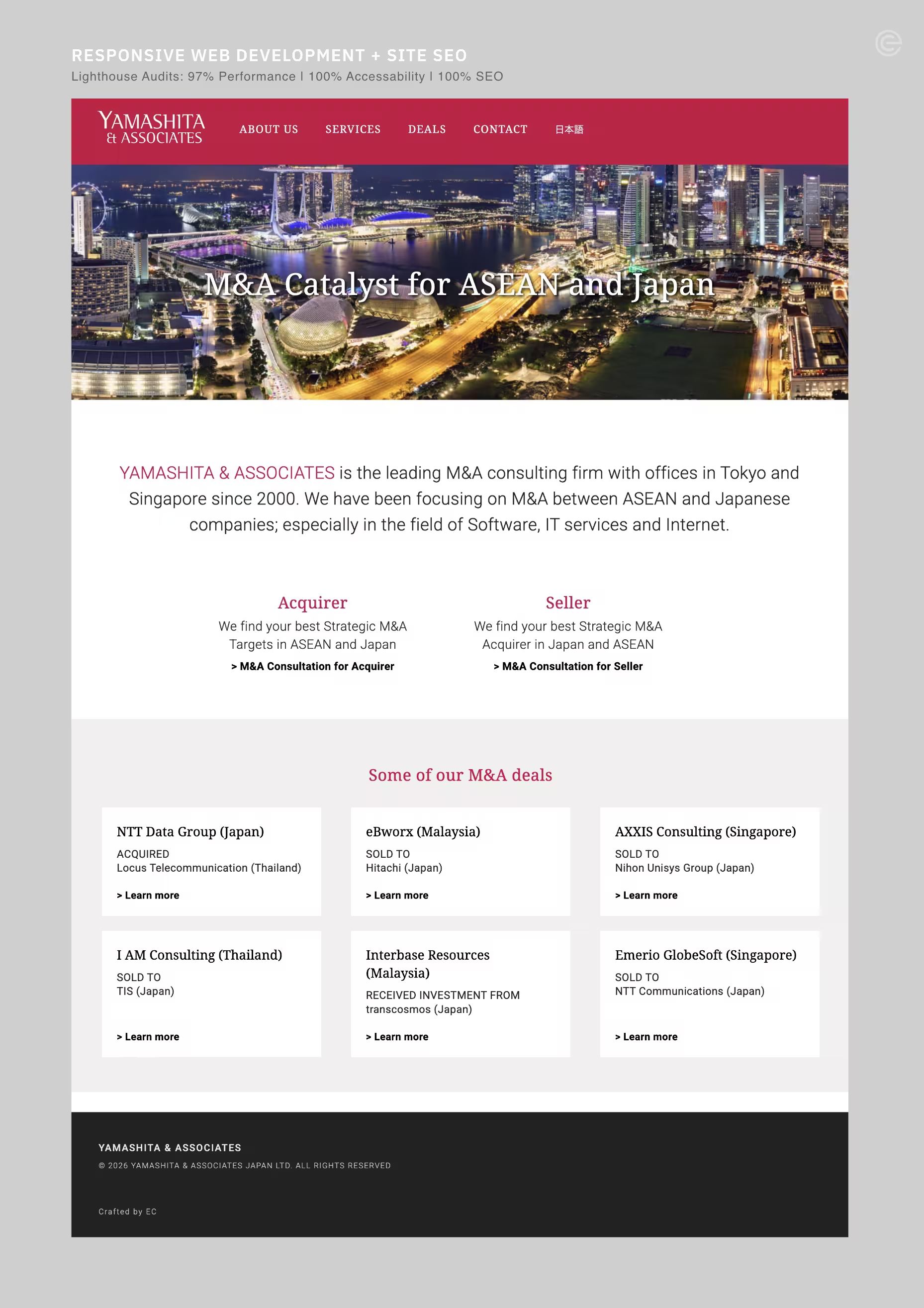
Founded in Singapore in 2000, Yamashita & Associates is a specialist M&A consulting firm focused on cross-border transactions between Japan and ASEAN. With particular expertise in software, IT services and Internet businesses, the firm has developed a strong network across both markets, advising on acquisitions, investments and strategic business alliances. Today, its operations span Singapore and Tokyo.
The challenge was to establish a visual identity that conveys the authority, precision and trust expected of an M&A specialist, while reflecting the firm's Japanese roots and cross-border expertise.
IDEATION
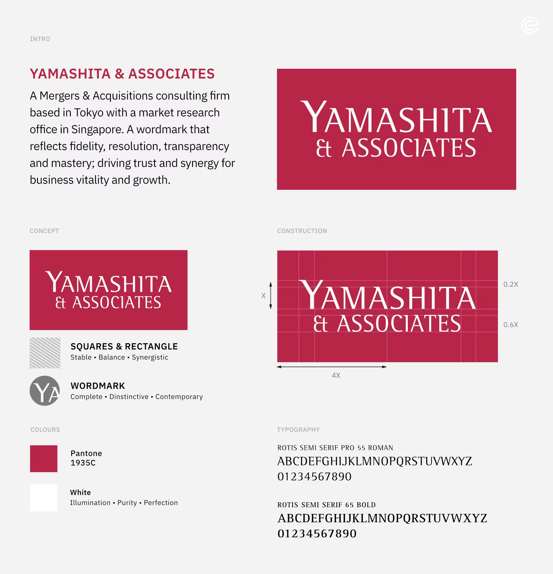
The identity takes its central idea from the very nature of M&A: two entities coming together to form a new whole. Two equal squares are brought together to create a single, stable rectangle – a simple geometric expression of acquisition, merger and synergy.
This concept informs both the visual construction and the character of the wordmark. The refined typography gives the identity a sense of authority and distinction, while the crimson field introduces confidence and a subtle reference to Japanese heritage.
The result is an identity that brings together two distinct elements into one unified expression – a visual reflection of merger, synergy and purposeful growth.